Composition “Rules” (Really guides, suggestions and options!)
Rule #1 – There are no rules! All the following composition advice should be considered as guides, suggestions, and options to consider trying while exercising your creativity. Use a composition that is consistent with your photographic vision for an image. If it works, don’t be afraid to break the rules.
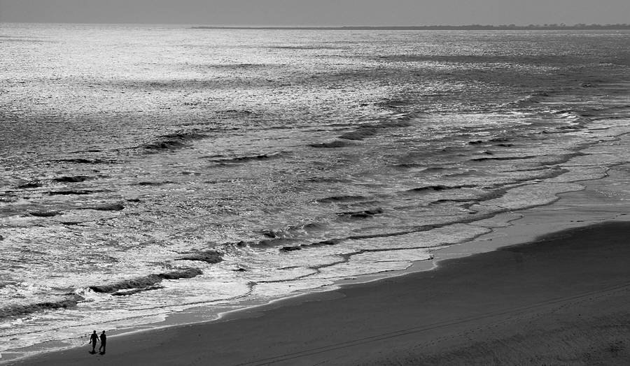
Long Beach Walk by Jim Harrison (2nd Place Open APS Competition 2008)
I’m not sure that Long Beach Walk follows any composition rules, except for having a level horizon. But it works for me! Does it work for you? Why, or why not?
Center of interest – Most images benefit by having at least one aspect that purposefully draws the viewer’s attention. Emphasizing what we covered in Part One (Introduction to Composition), the photographer’s first priority must be to include something (or things) in the image frame that will attract the viewer. Your composition should direct the viewer’s eye to something interesting right away.

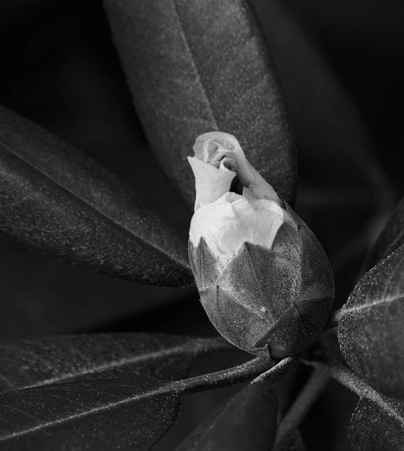
Global Warming by Jim Harrison (My very first 1st Place image in APS competitions 2008)
In Global Warming the flower, just beginning to bloom, constitutes the center of interest. All the rhododendron leaves point to the flower and there is no question what first draws the eye’s attention.
Should an image have just one center of interest, or more than one? This author’s strong belief is that having more than one interesting thing to look at in an image is a good thing (or at least OK, if done well). So, having multiple centers of interest isn’t something to avoid, it is something to consider. Having several things to focus attention on keeps the viewer’s interest. It can also enhance story telling by stressing the relationship(s) between different components of an image.

Charleston Fountain by Jim Harrison (Best-In-Show APS Salon Exhibition 2008)
Charleston Fountain’s main center of interest is the stunning flower. But this image has two more: the warm light reflected in the water, and the gargoyle-like source of water streaming into the pool. Having several centers of interest, in this photographer’s opinion, helped the image win Best-In-Show at the 2008 APS Salon.
Off-Center – We’ve all seen more than our share of snapshots, especially of family, friends and vacation sights, with the subject right in the middle. While we do want the subject(s) of our images to be prominent, they shouldn’t be just “targets in the cross-hairs.”
Almost all photos are way more interesting when the subject(s)/center(s) of interest are placed off-center. This can help tell the story in the photo by giving more emphasis to the context, details and patterns of the image. It also lends variety to the look of your images.

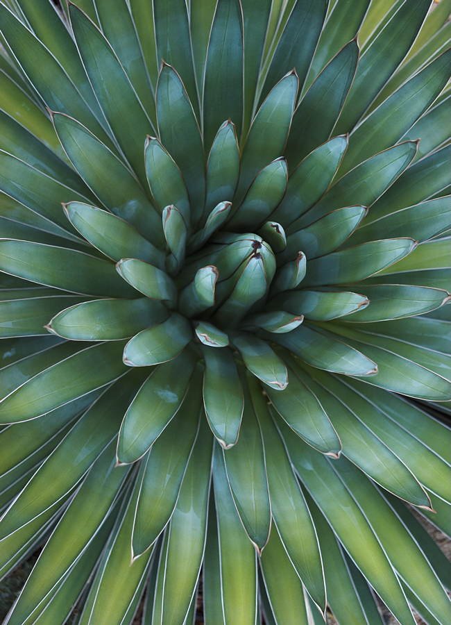
Concentric by Jim Harrison (HM APS Open Competition 2008)
The strong radial symmetry of Concentric was strengthened by placing the unfolding leaves of the center of the agave just away from the center of the image. This placement also helped emphasize the strong complementary colors.
Symmetry – Symmetrical things are almost universally pleasing to humans. Bilateral symmetry (the same on both sides) delights us especially since the human face and body, most animals, and many plants, exhibit almost perfect bilateral symmetry. Symmetry can often be pleasing in photographs.
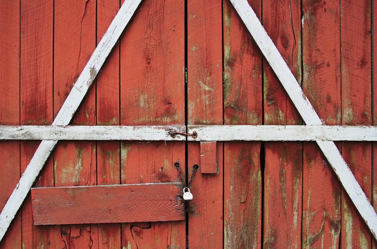
Closed Doors – The Old Red Barn by Jim Harrison (HM APS Open Competition 2018)
In Closed Doors... the strong symmetry of the barn doors’ construction and paint job made for a very graphic, symmetrical image design. And the asymmetries, the large horizontal red plank and smaller vertical red board, add lots of interest to the rich textures within the symmetry.
Whenever your subject, or tableaux, has symmetry consider taking advantage of that quality for your image. Keep your “mind’s eye” open to all kinds of symmetry. And be sure to notice any small things that break the symmetry; they can add a lot character to an image.
Simplicity – Simpler is almost always better. KISS – Keep It Simple Stupid! Get rid of distracting clutter. If it’s not essential to the image, leave it out.
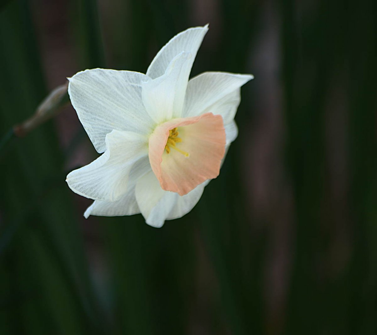
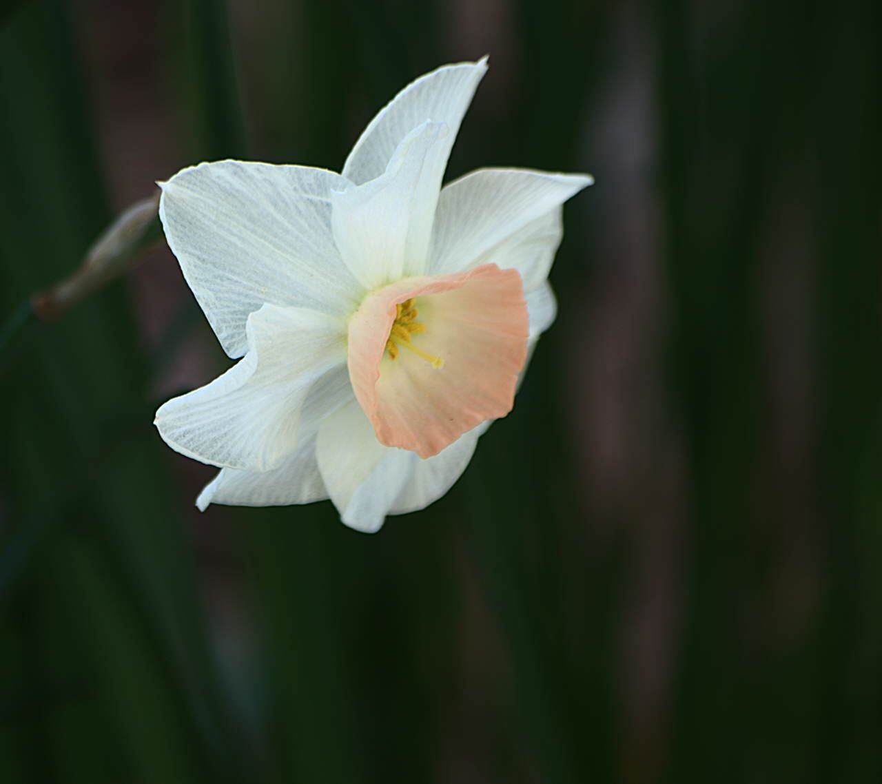
Pastel by Jim Harrison (HM APS Open Competition 2014)
Pastel depicts a very simple flower, with a very simple (out of focus) background. Selective focus helps the flower “pop” away from the muted background detail. It works. Simple almost always does!
“Rule” of Thirds – Putting the subjects in our photographs off center brings up the natural question, “Where off center?” Placing your subject(s) or center(s) of interest about 1/3 from the sides and top or bottom of an image often works well – so well in fact that many photographers refer to this as “the Rule of Thirds.” It won’t work every time, but it’s usually worth a try!
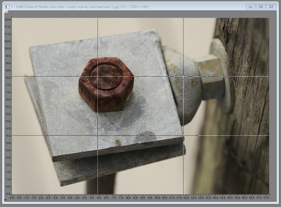
Rusty Nut by Jim Harrison (HM APS Open Competition 2019)
I love photographing the mundane – things that others may not notice at all. The “Rule of Thirds” (along with very careful selective focus, no distracting background, and interesting accompanying detail) worked well for Rusty Nut. (Note: My image editing program, Picture Window Pro, includes a very handy “grids” tool – it provided the vertical and horizontal “thirds” lines superimposed on Rusty Nut.)
Other Useful Guides
Other proportions besides “thirds” can also work well for photographic composition. Two prominent ones include the Golden Mean and Root 5.
Golden Mean – I won’t describe the mathematics of the Golden Mean here; just use your “Google Foo” to learn more than you’d ever want to know. The main thing to know is that the rectangle defined by the Golden Mean (for any particular aspect ratio) tends to be somewhat smaller than one dividing an image into thirds.
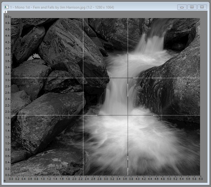
Fern and Falls by Jim Harrison (1st Place Open Competition 2012)
We see that the central features of Fern and Falls are placed close to the Golden Mean’s intersecting lines. (The image also includes additional centers of interest; we’ll talk about combinations of composition guides in the next article.)
Root 5 – Again, if you’re curious about the math, practice that “Google Foo!” Similarly, the main thing to know is that the rectangle defined by Root 5 tends to be a slightly larger rectangle than one dividing an image into thirds.
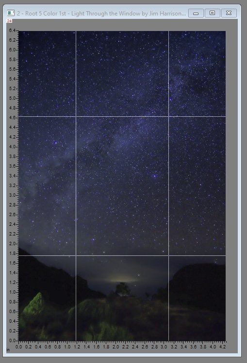
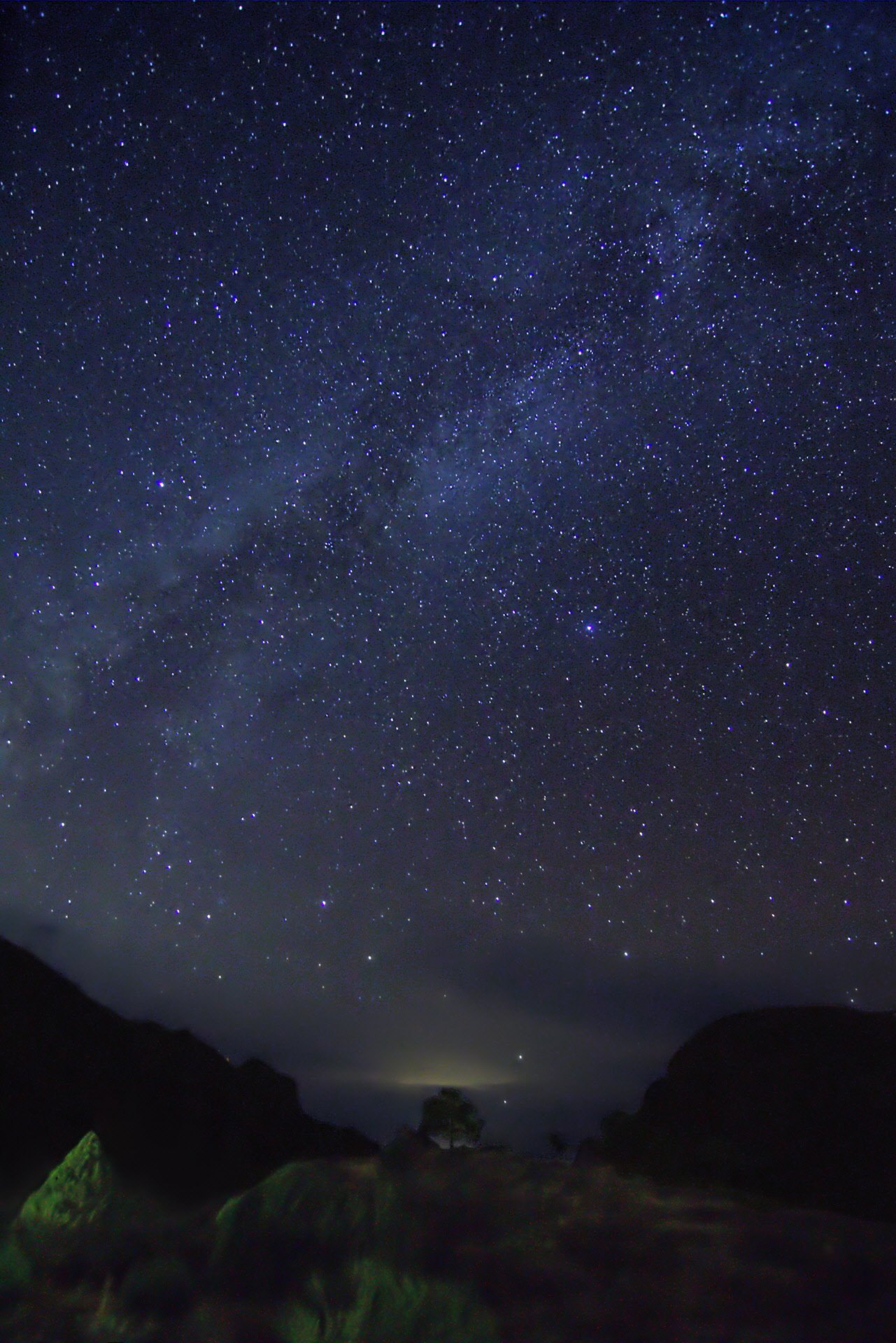
Light Through the Window by Jim Harrison (1st Place Open Competition 2018)
In Light Through the Window, the tops of the mountains and the most prominent break in the diagonal line of the Milky Way both intersect with "Root 5" rectangle. This image was exposed and processed to approximate a very natural view of what the human eye could see.
The practical lesson here - If the “Rule of Thirds” doesn’t quite seem to work for a particular image composition, try moving your center(s) of interest/subject(s) slightly in toward the center of your image, or slightly out toward the edges of your image. You’ll be employing the Golden Mean and Root 5 proportions respectively. Congratulate yourself - genius at work! And you might get a much more pleasing composition; or maybe not, but it’s worth a try! (Note: Picture Window Pro’s “Grids Tool” also includes the Golden Mean, Root 5, and others.)
One last hint to conclude this section: If you like an image’s composition, but you are not sure why that composition seems so pleasing, try checking the thirds, golden mean and root 5 divisions/lines. You might just discover that the composition contains one (or more) of those “special proportions” that naturally please our eyes.
Stay tuned for, "Approaches to Composition continued," for still more interesting composition methods.
Note: All of the images in this article have received awards in APS competitions.
Previous Composition Articles:
Introduction to Composition -Part One
Understanding Composition from Great Works of Art - Part Two
Understanding Composition from Great Works of Art - Part Two (continued)
Info & Download for Picture Window Pro: Picture Window Pro Link
Comments/Questions? - Contact Jim Harrison (Right Click to copy email address.)