Backgrounds
Backgrounds can make or break a picture. The background should either complement the subject or be an integral part of the subject. You should always pay careful attention to the background behind your subject.
For example, does the background have annoying patterns, distracting lines, or vibrant colors? Are there patches of bright lights or colors which eclipse the subject? Does a pole or unwanted tree stick up behind the subject’s head? Is the background or part of it significantly lighter than the subject?

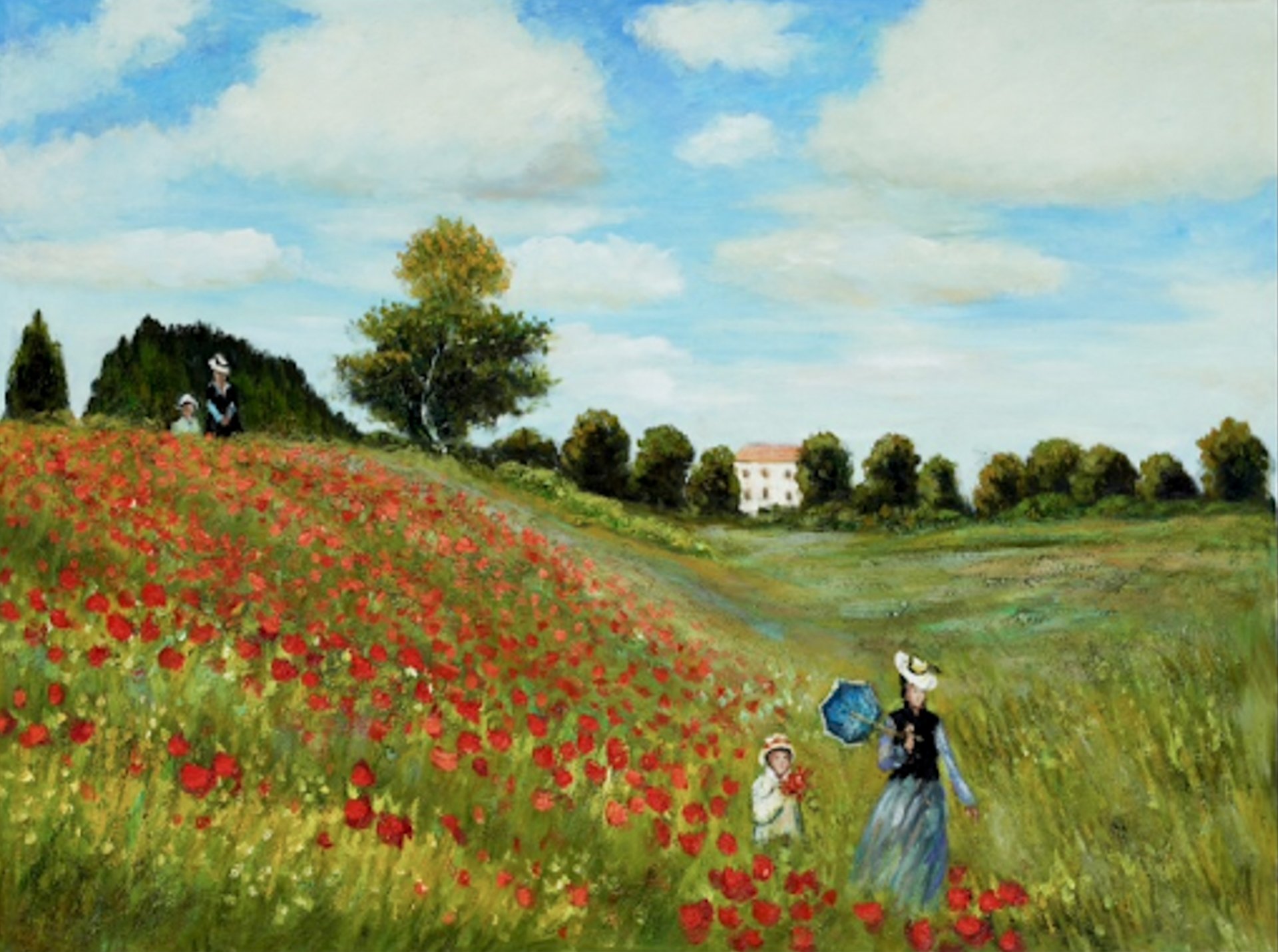
The Poppy Field by Monet
The painting by Monet illustrates how the background can complement and integrate with the subject without distracting one’s attention. Notice how the colors of the background are soft - not distracting. All the elements blend together, nicely capturing the essence of the entire scene.

Red Throated Warbler by Mike Shaefer
One of the best ways to eliminate distracting elements behind a subject is to throw them out of focus where nothing in the background is recognizable. The photo of the bird used a telephoto lens with a focal length of 420mm and an aperture of f/4 to get the ‘creamy’ background.
If the background is just behind the subject and you are not close to the subject, you may not be able to fully blur the background even with a long telephoto lens and a wide aperture. In this case you may need to choose a different composition/background or even replace the background in post processing.
The background doesn’t have to be out of focus. You may want to include the background if it compliments or augments the subject and is not distracting. You do not want the background to compete too much with your subject even if it is visually appealing.
Classic Landscape and Depth of Field Technique

Arcadian Landscape by Iris Scott
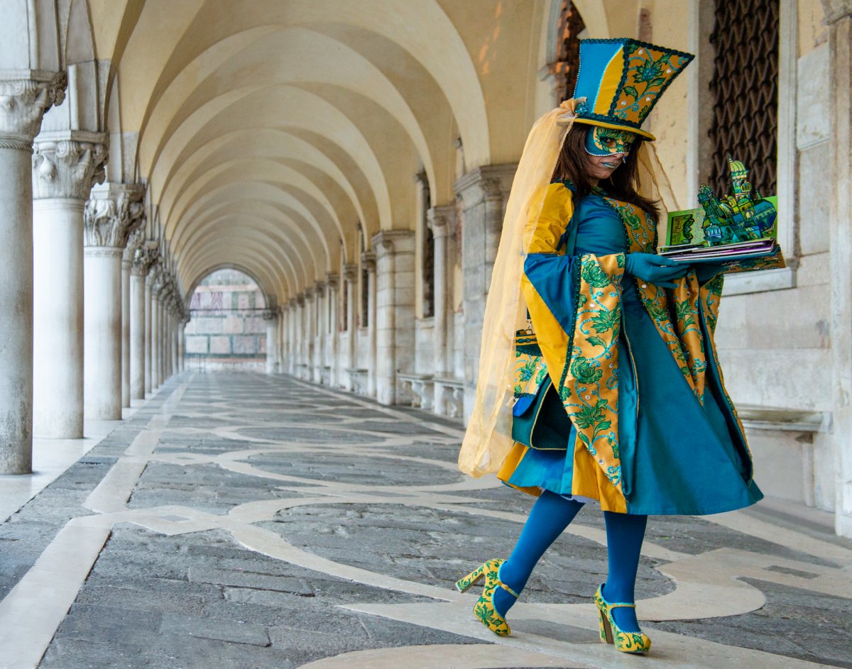 Carnevale Pose by Mike Shaefer
What do you need to create a classic landscape or wide-angle image like those often included in the pages of National Geographic? As seen in the painting by Iris Scott and my photograph above, you need a strong foreground and an interesting or beautiful background. For starters, you want a complete depth of field from close to far so there is a tremendous sense of depth and dimension. This means you will need to place the foreground close to the camera.
The “equation” for a classic landscape and/or Depth of Field image is this: A wide angle lens + f/stop of f/22 + a tripod + a compelling/interesting subject close to the lens (about 5 feet often works well) + focus the lens a bit past the subject (about 8 feet often works well) = a successful classic landscape you can be proud of and others will appreciate.
Balance
Good composition often possesses a strong sense of balance. Balance is where the ‘weight’ of the subject(s)/object(s) comprising the image makes sense visually. Kind of like two children of similar weight on a seesaw. One can even choose to place a subject in the middle of the frame to achieve a sense of balance, even if the “rule of thirds” (see Part 3) isn’t used for a composition.
Nature is often not in balance. It is filled with all kinds of shapes, and patterns of light, colors, and textures. Composing an image with a sense of balance may be difficult sometimes. However, when faced with a group of objects with different shapes and sizes, it still may be possible to create a very pleasing and balanced composition by placing the objects on either side of an imaginary seesaw and a fulcrum in the middle. One side may or may not be higher than the other, but in either case a sense of balance will be achieved along with a well composed image.

School of Athens by Raphael
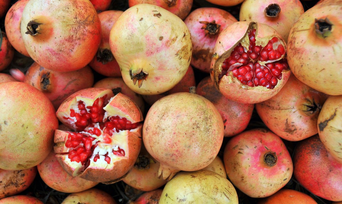
Pomegranate Balance by Mike Shaefer
In the painting by Raphael, you can see how the left and right side are visually ‘weighted’ the same. In the photo of the fruit, balance is used to make an otherwise dull photo visually appealing. The fruit between the two cut fruits visually represents the fulcrum of a seesaw.
Negative Space
Using negative space is another way of creating a sense of balance for your image composition. Negative space is an area of an image that is largely devoid of subject matter. Examples of negative space are large areas of the sky, an expanse of a painted wall, a body of water, or a field of snow. Negative space typically possesses texture and detail, but no subject matter or other elements that exhibit a graphic design. The painting by Winslow Homer is a good example of effective use of negative space.
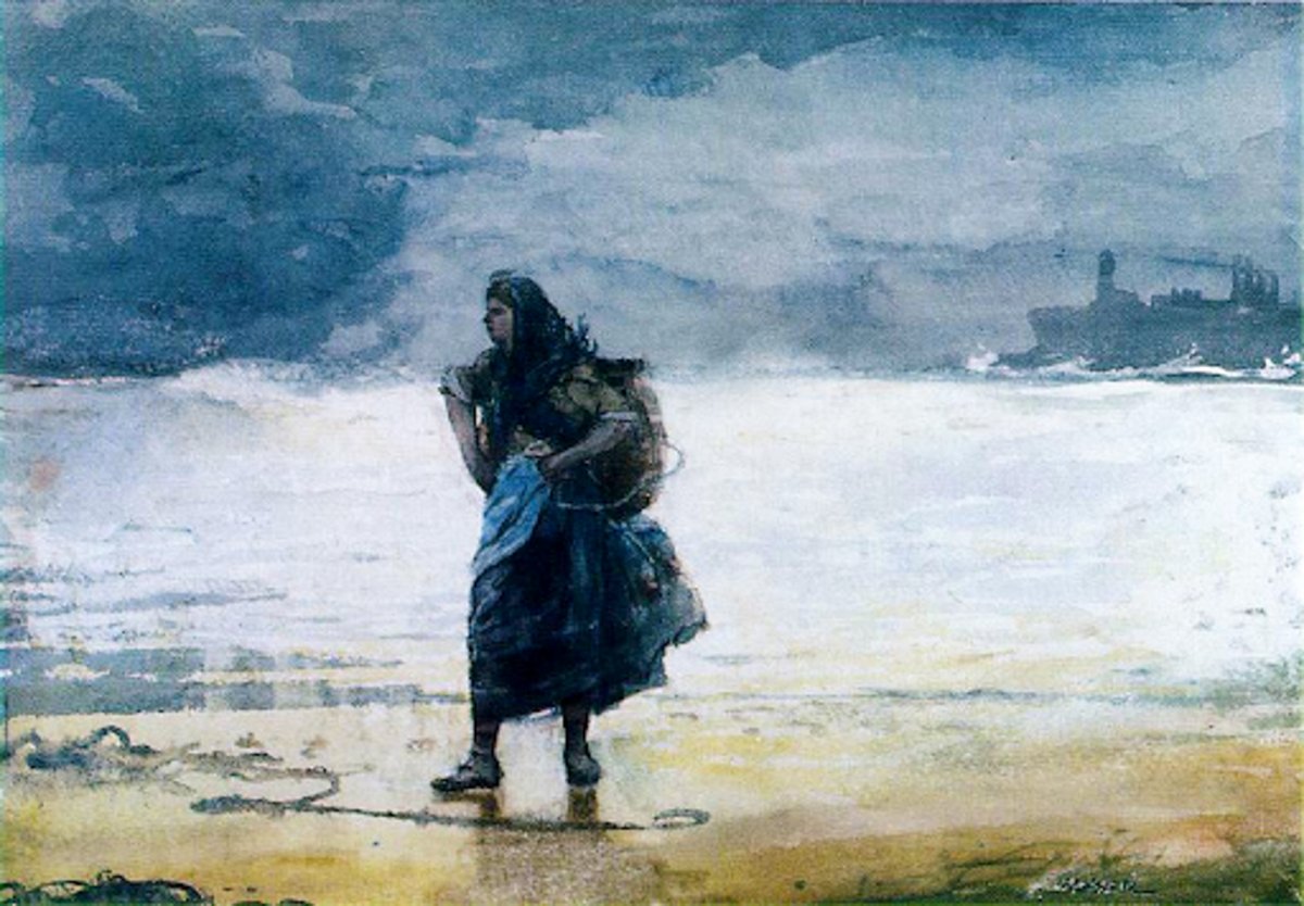
The Gale by Winslow Homer
You want to make sure the ‘negative space’ in your image helps bring the image into balance or provides context to the subject. You can also use negative space to bring attention to the subject and minimize distractions.
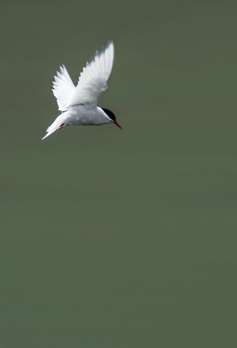
Antarctic Turn by Mike Shaefer
In the photograph of the white bird, the negative space brings attention to the subject and to the entire image. Bird photography is a very mature genre and we see images of birds everywhere, often with busy, cluttered backgrounds. Thus, negative space helps make this bird image different from the norm.
Negative space also helps to show the spatial context of the bird’s perspective. I chose a vertical orientation because the bird appears to be looking downward, suggesting its’ likely flight path. One could argue there is too much negative space, but to my sense of aesthetics, this works.
Author, Mike Shaefer